Umoja
Product Design
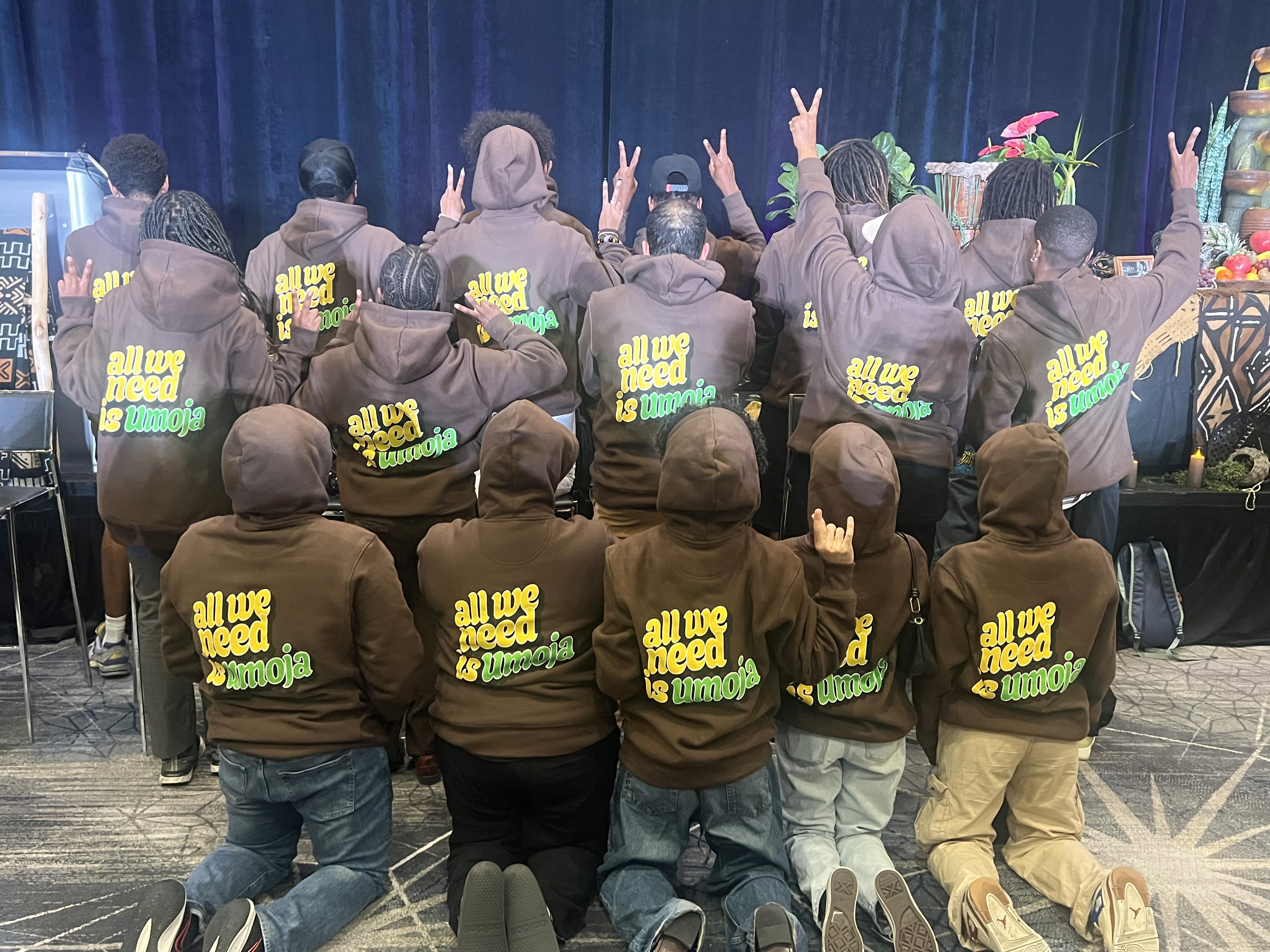
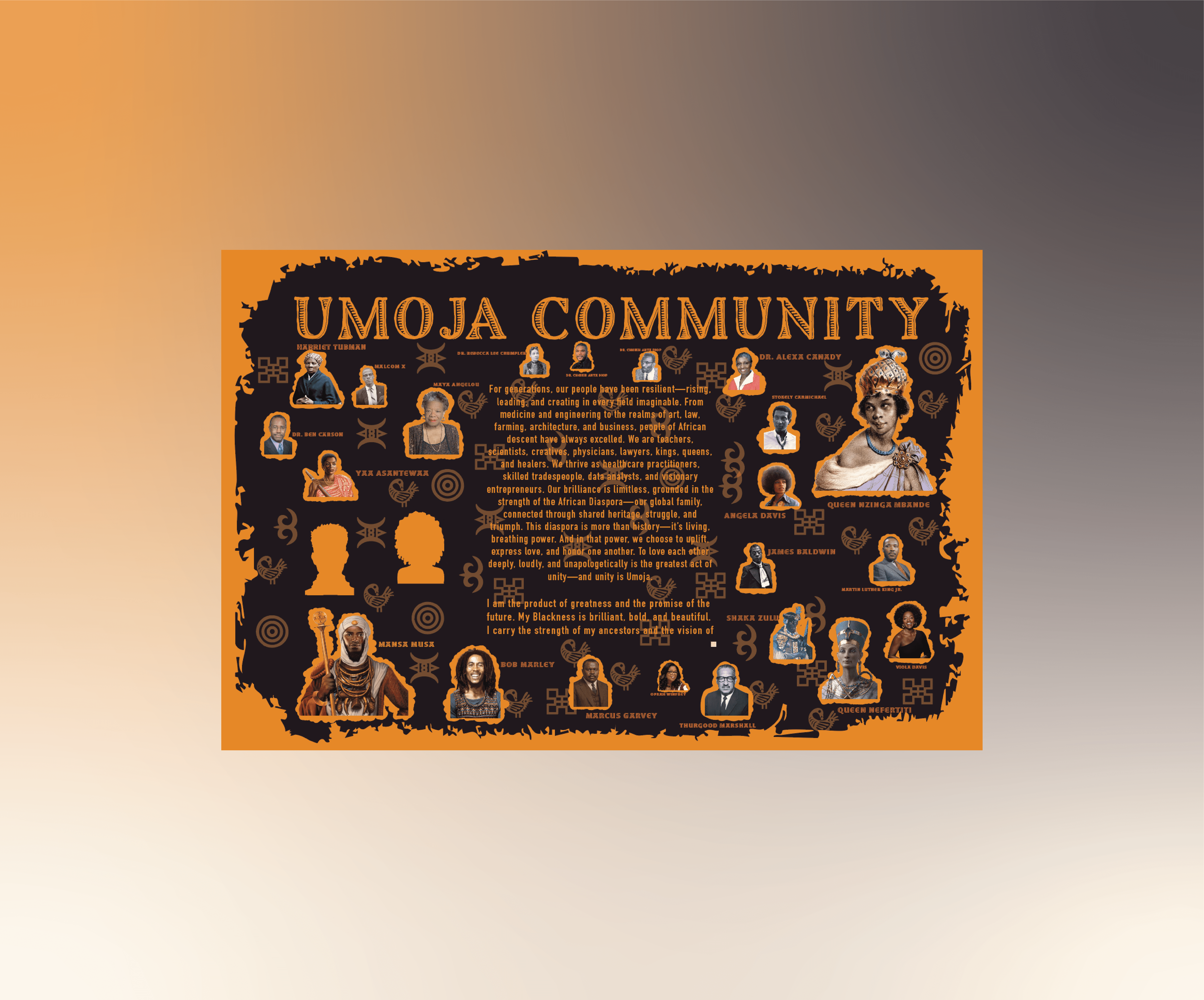
From 2023 to 2025, I worked with Umoja, contributing to both product design and brand identity growth. My role combined UX principles with creative branding, allowing me to design assets that strengthened Umoja’s presence and connected with its community. During this time, I created a wide range of deliverables including Instagram posts, slideshows, posters, flyers, a wall mural, and branded merchandise like hoodies. Each project was an opportunity to unify Umoja’s visual identity, increase engagement, and translate its values of community, empowerment, and education into accessible design. By focusing on clarity, consistency, and creativity, I helped build a brand presence that was not only visually cohesive but also meaningful to the audience it served.
Role:
Ux Designer, Product designer,
Industry:
Platform:
Overview
Throughout my work with Umoja from 2023 to 2025, I applied a wide range of design principles and practices to create cohesive, impactful, and user-centered assets across digital and physical platforms. I used Gestalt principles like proximity, similarity, and continuity to create flow and intuitive layouts, while graphic design and illustration allowed me to develop posters, flyers, slideshows, merchandise, and a large-scale mural that visually reflected Umoja’s values. Content design played a key role in structuring information clearly and concisely, ensuring audiences could quickly understand event details and calls to action. I maintained ethical practices by considering media copyrights, using original or licensed assets, and kept strong visual hierarchy by scaling and positioning type and imagery to highlight the most important information first. Branding choices emphasized consistency across all outputs, supported by careful typography selection, color theory for emotional impact, and visual accessibility through high-contrast, legible text. For larger projects like slideshows and campaigns, I used information architecture to organize content logically, guiding the audience through a clear narrative. Finally, I developed governance and processes to keep designs consistent and scalable, ensuring Umoja’s identity stayed unified across every touchpoint.
Problem Area
When I began working with Umoja, one of the main challenges was the lack of a unified visual identity across different platforms and media. Instagram posts, flyers, and event materials often felt inconsistent, making it harder to strengthen brand recognition. Another problem area was accessibility — some designs lacked strong contrast or clear hierarchy, which made information harder to read quickly. There was also no structured process or governance system in place, so content and design sometimes felt disconnected from Umoja’s core values of community and empowerment. My objective was to address these issues by developing consistent branding, applying UX and design principles across all outputs, and ensuring every piece of content — whether digital, physical, or experiential like the wall mural — was clear, accessible, and reflective of Umoja’s mission.
Solution
To solve these challenges, I developed a cohesive design system that tied all of Umoja’s outputs together, from social media posts to physical merchandise and event materials. I created consistent branding by applying the same typography, color palette, and layout principles across every asset, making the identity instantly recognizable. Accessibility was improved by ensuring strong contrast ratios, clear hierarchy, and legible type so that information could be understood quickly in both digital and print formats. For larger projects like slideshows and murals, I applied information architecture to organize content logically and keep narratives easy to follow. I also integrated Gestalt principles and visual hierarchy to guide the audience’s eye and highlight what mattered most, whether it was an event date, a call to action, or Umoja’s message of community. Finally, I began shaping governance and process by establishing repeatable design practices, ensuring that future assets would remain consistent, scalable, and aligned with Umoja’s mission.

Project images
hey


Deep Dive
Design
Branding
Summary
I built a cohesive brand system around Umoja’s core values—community, empowerment, cultural pride—then applied it consistently across social, print, merchandise, slideshows, and the wall mural. Repeating assets (logo/wordmark, Pan-African–inspired palette, patterned borders, tone of voice) created instant recognition from a hoodie in the lounge to a flyer in a hallway.
Keypoints
Consistent logo use on chest (hoodie) and lockups on posters.
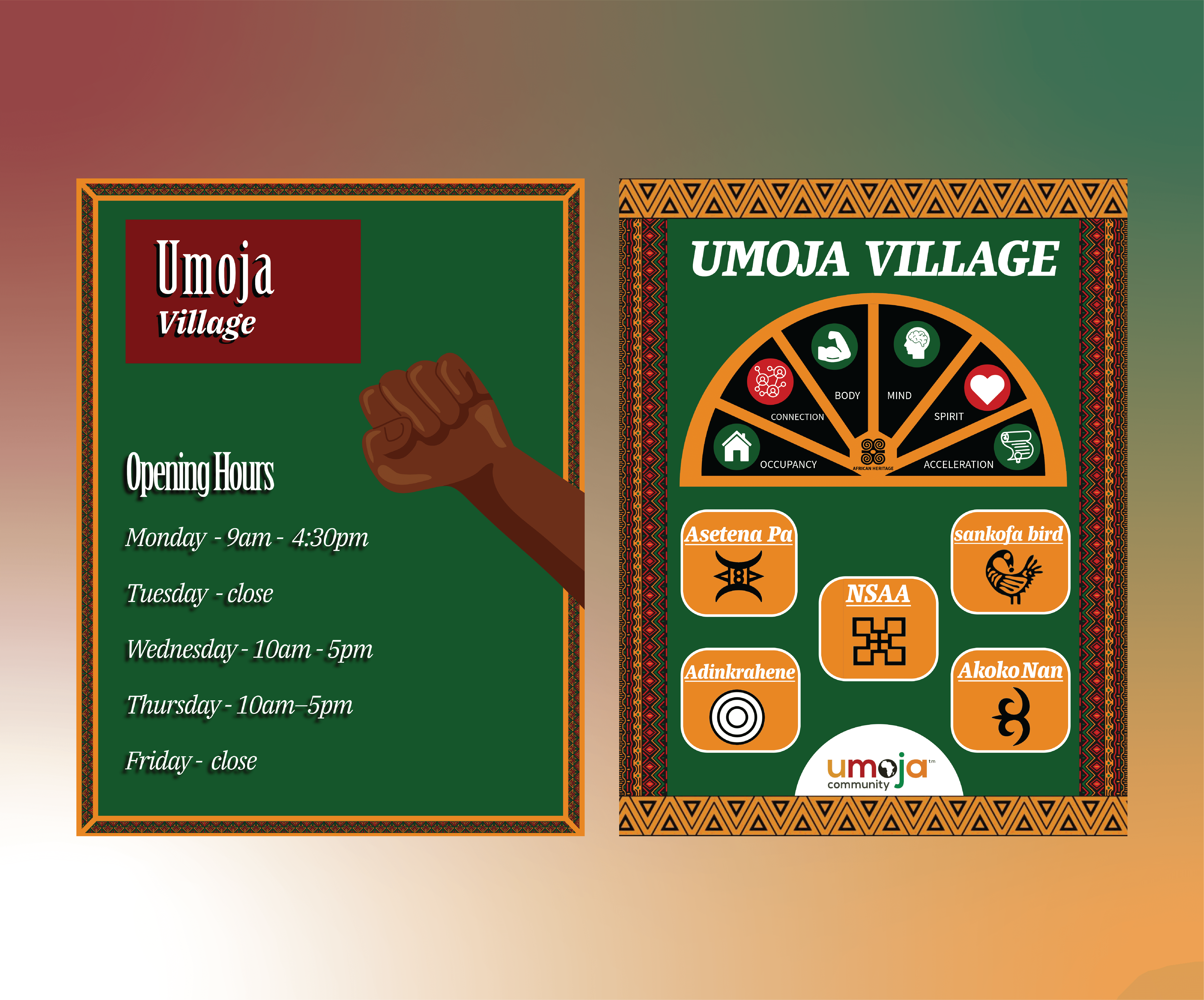
Repeated cultural pattern frames (e.g., opening-hours & “Umoja Village” posters) to signal brand ownership.
Slogan voice on merch (“all we need is umoja”) to humanize the brand.
One system, many formats: social, print, large-format mural, apparel.
UX Writing
Summary
I focused on writing that was clear, concise, and aligned with Umoja’s community voice. My goal was to make event details, calls to action, and brand slogans easy to understand at a glance, while also carrying Umoja’s tone of empowerment and inclusivity. Copy avoided jargon and internal language, instead speaking directly to students and community members. I kept text minimal but meaningful, making sure every word had purpose and supported the visual hierarchy of the design.
Keypoints
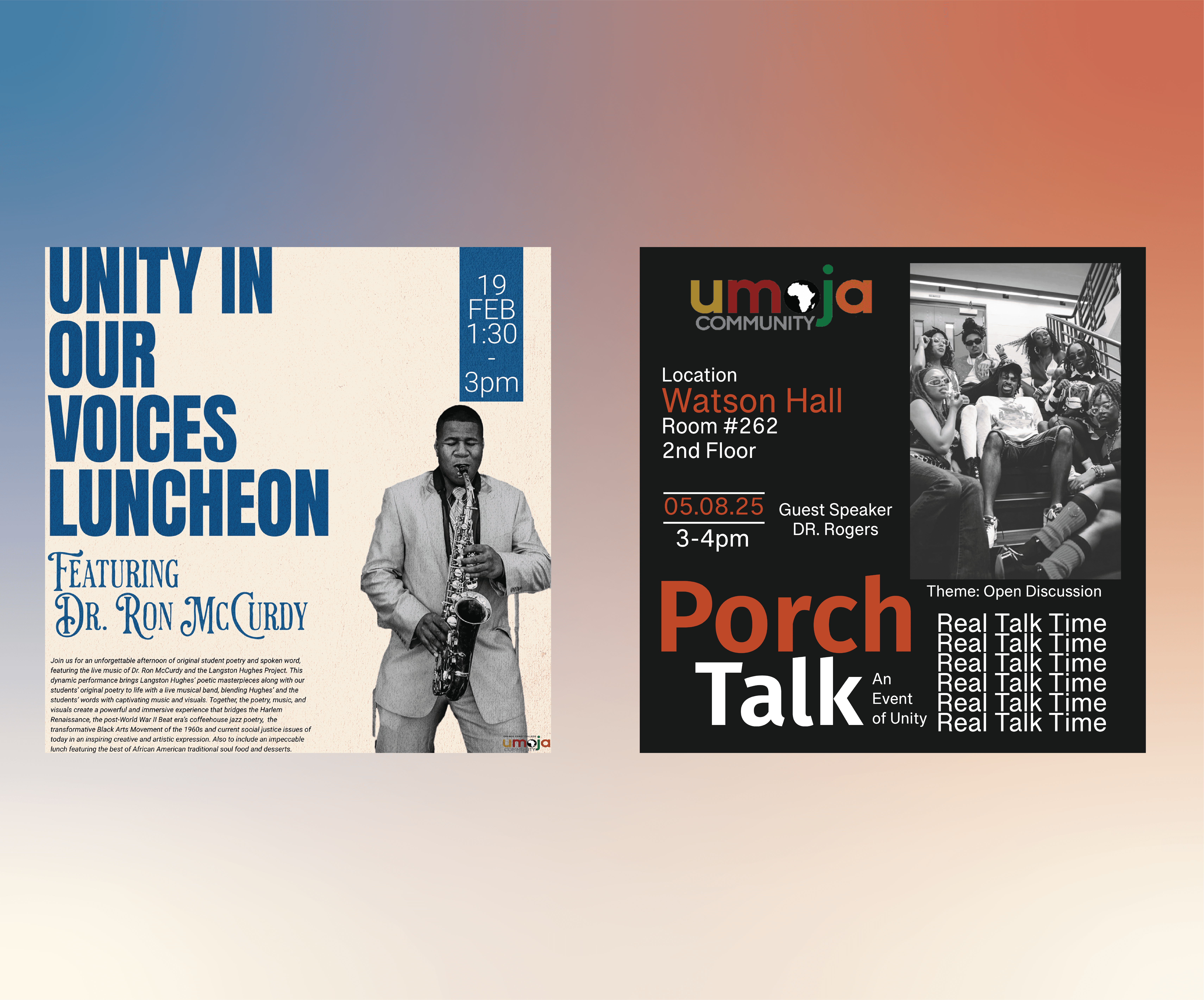
Clear, plain language for events (e.g., “Porch Talk: An Event of Unity”).
Short, motivating slogans for merch (“all we need is Umoja”).
Structured text for quick scanning: What, When, Where.
Consistent tone across posters, flyers, and social posts.
Copy aligned with user goals (e.g., knowing time/place quickly) rather than internal branding jargon.
Graphic Design
Summary
Layouts balanced clarity and energy. I kept compositions clean so dates/locations never fight the visuals, and tuned each format for viewing distance (hallway poster vs. square social post vs. hoodie placement).
Keypoints
Grid-based layouts for flyers and IG; generous margins for legibility.
Production-aware placements on apparel (front crest + bold back graphic).
Texture and photo treatments (e.g., Luncheon poster’s vintage jazz vibe) to fit event mood without hurting readability.
Colour Theory
Summary
I leaned on a Pan-African–inspired palette (green, red, gold, black) and added neutrals when needed for contrast. Colors were chosen for emotion (warmth, unity, power) and function (readability across print/digital).
Keypoints
High-contrast pairs (cream/navy on Luncheon; white/orange on black for Porch Talk).
Consistent accent rhythm: gold/orange for calls-to-action, green for foundation.
Saturation tuned so photos/illustrations don’t overpower type.
Typography
Summary
Type pairings balanced personality with clarity. I used strong display type for headlines and highly legible sans/serif for details, scaling weights/sizes to create a predictable reading order across assets.
Keypoints
Big headline lockups (“PORCH TALK”, “UNITY IN OUR VOICES”) for immediate grab.
Secondary type for date/time/location blocks; consistent line-length targets.
Letter-spacing and weight adjustments for long-range readability on posters.
Content Design
Summary
Information was structured around user needs: What is it? When? Where? Why should I care? I kept copy concise and consistent in tone, and placed details where the eye naturally lands.
Keypoints
Clear event stacks (location → room → date/time) on Porch Talk.
Opening-hours flyer lists days/times in an easy scan column.
Short value framing in headlines/subheads; minimal body copy; obvious CTAs.
Media Copyrights
Summary
I prioritized ethical use of media across community photos, iconography, patterns, and fonts—either creating originals, licensing assets, or using rights-cleared materials, and crediting/obtaining permissions where appropriate.
Keypoints
Rights-checked fonts/images; original illustrations where possible.
Permission/attribution for community photography.
Centralized file/source tracking to keep usage clean.
Visual Hierarchy
Summary
Hierarchy guided every piece so viewers get the essentials in seconds, then details. I used scale, contrast, and placement to create a left-to-right/top-to-bottom reading path.
Keypoints
Oversized headlines; bold date/time modules; supportive body text.
High contrast between text and background; consistent spacing rhythm.
Photo framing that never competes with core info (e.g., Porch Talk).
Illustration Design
Summary
Custom/curated visuals carried culture and story. I created vector elements (e.g., raised-fist motif) and used/adapted Adinkra symbols within respectful, educational context (the “Umoja Village” poster).
Keypoints
Clean vectors for scalability across print/merch.
Symbol use paired with labels to add meaning, not just decoration.
Image borders/patterns reused as a signature brand element.
Gestalt Principles
Summary
I used proximity, similarity, common region, and continuity to keep layouts intuitive and scannable. Repetition across pieces builds recognition.
Keypoints
Proximity: grouped date/time/location; grouped icon + label tiles.
Common region: patterned frames unify content blocks as one story.
Continuity: aligned baselines/edges lead the eye through the page.
Similarity: repeated colors/shapes across flyers and posters = cohesion.
Visual Accessibility
Summary
Accessibility checks were baked in—contrast ratios, minimum sizes, legible type, and color-blind-friendly pairings—so content works for more people, in more contexts.
Keypoints
Contrast checked for headings/body; no text on busy areas.
Minimum text sizes for hallway reading distance; touch-safe color choices for screen.
Alt-friendly copy and descriptive captions for social.
Information Architecture (IA)
Summary
I structured information so audiences can orient fast, then dive deeper. Slideshows and the “Umoja Village” poster use chunking and logical grouping to teach at a glance.
Keypoints
Headline → essentials → optional detail pattern.
Icon-label tiles to explain pillars/values quickly.
Progressive disclosure in carousels/slides: one idea per frame.
Governance & Process
Summary
To keep output consistent over two years, I created light-weight governance: a brand kit, reusable templates, and a file-naming/asset system so anyone producing content could stay on brand.
Keypoints
Template packs for IG/flyers; export presets for print/digital.
Mini style guide (logo use, colors, type, patterns, tone).
Centralized asset library and checklist for approvals.
Reflecting on the Design Process Revealed the Importance of Structure, Credible Research, and Continuous Testing
Summary
Summary
Working with Umoja from 2023–2025 taught me how to balance product design and brand identity across multiple mediums while staying true to a community-focused mission. I learned the importance of building cohesion in branding through consistency in typography, color, and patterns, and how even small design choices—like repeating borders or slogans—can strengthen recognition. This project also deepened my understanding of accessibility, showing me how contrast, readability, and inclusive writing practices directly impact how people engage with content. A major lesson came from interviewing Umoja students directly, asking open-ended questions about what motivates them, what Umoja means to them, and how they engage with events and spaces. Their feedback gave me authentic insights that influenced how I crafted slogans, structured event flyers, and designed community-focused materials like the “Porch Talk” series. It showed me how listening to real users leads to more relevant and powerful design outcomes. Another key lesson was the value of governance: by building templates, systems, and processes, I gave Umoja a scalable brand foundation that could continue beyond my time there. Looking back, one thing I would have done differently is share my designs more frequently with other designers to gather feedback and refine my work through iteration. Doing so would have given me additional perspectives and pushed the designs even further. Overall, this experience taught me that strong design is not just about creating visuals—it’s about systems, research, iteration, and storytelling that amplify the voices of the community you’re designing for.
Keypoints
Learned how to maintain brand consistency across print, digital, merchandise, and large-scale installations.
Strengthened accessibility practices by testing color contrast, hierarchy, and readability.
Discovered the value of governance and templates to keep branding scalable and efficient.
Improved UX writing by focusing on plain language, concise event details, and motivating slogans.
Saw how illustration and cultural symbols can be used respectfully to reinforce identity.
Gained valuable insights through interviews with Umoja students, shaping slogans and event design.
Learned how user feedback and research directly strengthen design decisions.
Would improve future work by showcasing designs to other designers for critique and iteration.
Recognized that design in a community setting is about more than visuals—it’s about systems, authenticity, and amplifying real voices.
Closing
Thank you for taking the time to explore my Umoja case study. This work was especially meaningful because it allowed me to merge design strategy with community impact, creating assets that reflected Umoja’s values while amplifying student voices. Over the span of two years, I grew as a designer by applying research, accessibility, branding, and governance practices in real-world projects that directly served a community. If you’d like to connect, collaborate, or learn more about my process, my contact information is available at the bottom of the page.