Increasing Task Completion by 40% While Reducing Completion Time by 15%
GoodRX

Role:
Lead Product Designer
Industry:
Healthcare
Timeline:
2 Months
Platform:
Web app
From a Confusing Savings Journey to Redesigned Flows That Help Users Compare Prices and Redeem Coupons Faster
Overview

Overview
Users have difficulty understanding which pharmacy offers the best value because important pricing and savings information is not immediately clear.
Problem Area
Optimize GoodRx's core medication savings flows to increase coupon redemption rates, drive more pharmacy transactions, improve customer retention, and contribute to revenue growth.
Solution
The redesigned flows increased successful task completion by 40 percentage points and reduced average completion time by 15%. These results were measured through comparative usability testing with 10 participants across the medication search, pharmacy comparison, and coupon redemption flows.
Turning a Distributed Design Team Into an Organized Workflow Through Slack, Sprint Planning, and Task Allocation
Project Mangment
I led the project by creating a structured workflow that kept the team aligned from planning through final design. Slack served as the central hub for communication, project updates, deadlines, and feedback, while weekly sprints helped organize the work into clear phases and milestones. I also reviewed each designer’s strengths and experience before assigning tasks, which helped distribute research, audits, ideation, wireframing, and design responsibilities more intentionally.
Throughout the project, I monitored progress, reviewed deliverables, adjusted timelines, and reassigned work when team availability or performance changed. I also stepped in to support research and design tasks when needed to keep the project moving forward. This process helped maintain momentum across the team while giving me experience in sprint planning, task allocation, communication, quality control, and adapting to challenges throughout a collaborative UX project.


Project Planning
Finding That Users Struggled to Compare Pharmacy Value Through Experience Audits, Interviews, and Flow Testing
Research
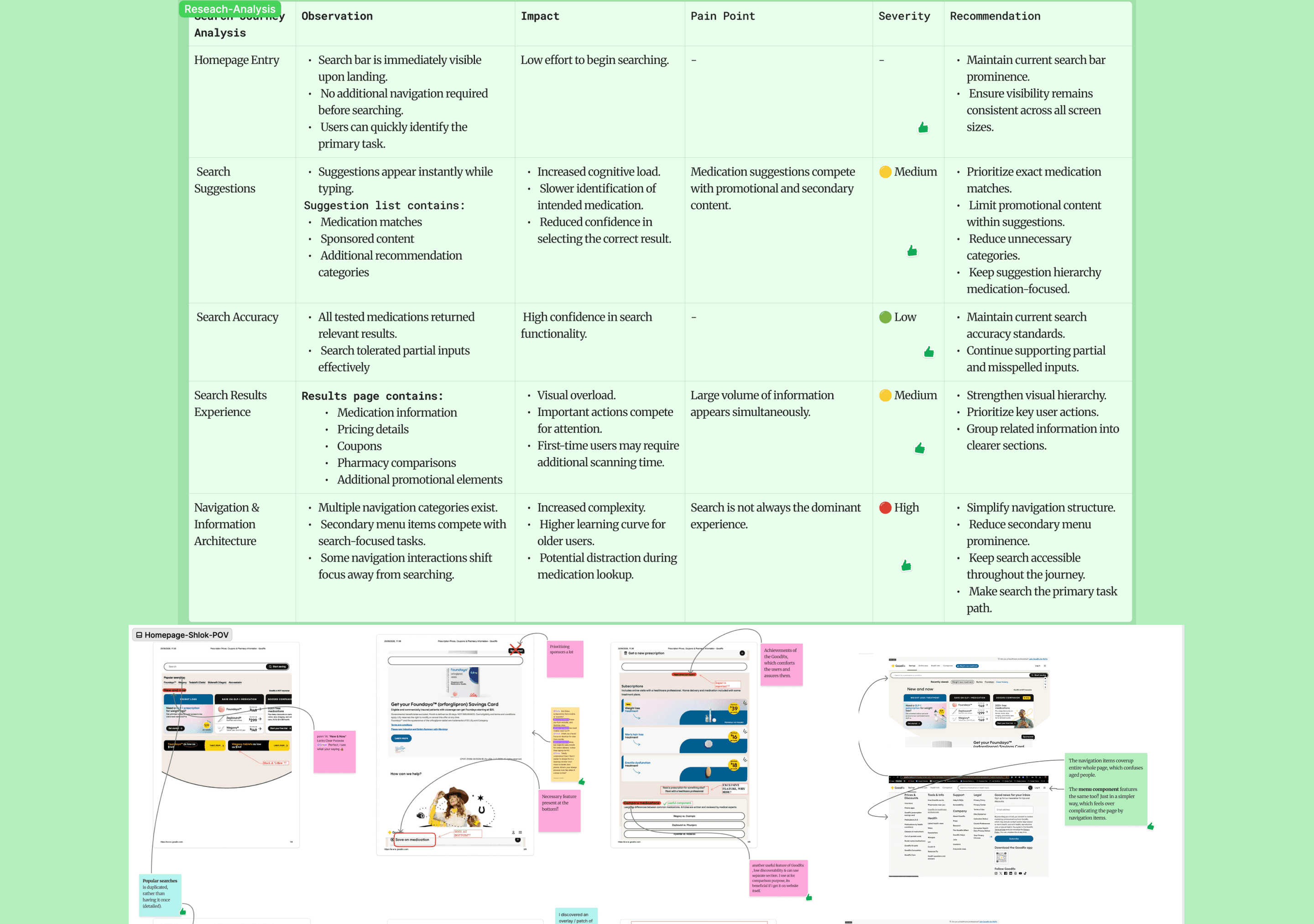
We began by auditing GoodRx’s homepage and core medication, pharmacy comparison, and coupon redemption flows. We also reviewed user feedback, conducted competitive research, and created a current-state journey map. These findings helped us form early hypotheses around promotional clutter, unclear savings information, and difficulty comparing pharmacy value, which we used to develop the project’s problem statement and narrow the research direction.
We then conducted interviews and task-based usability testing with seven existing and first-time GoodRx users to validate those assumptions. The findings informed our personas and final design priorities. ChatGPT supported the process by helping synthesize research notes, identify recurring themes, refine hypotheses, and organize findings, while the team’s research and user testing guided the final decisions.


Competitive analysis
Home Page Audit

User testing process
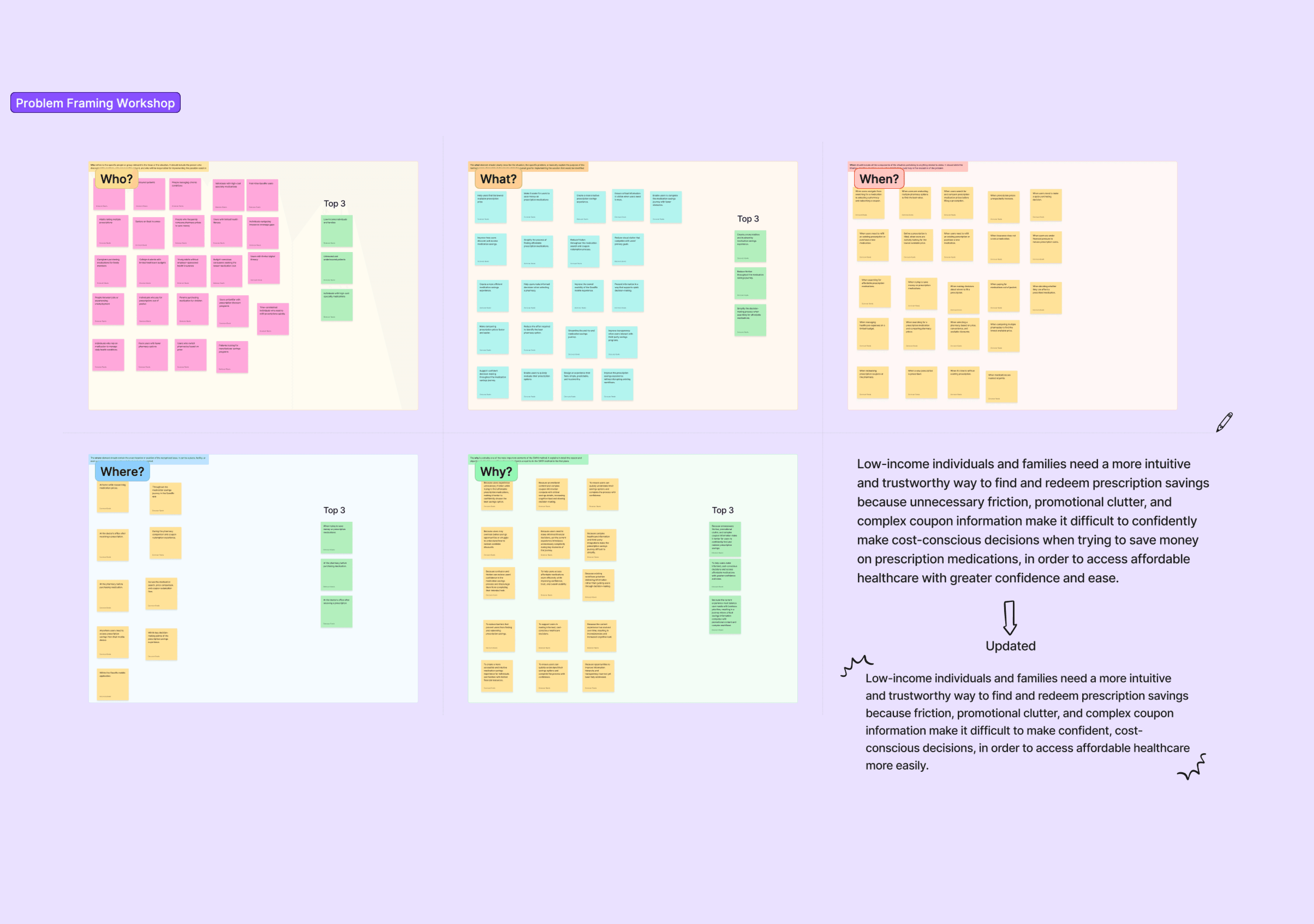
Problem Statement
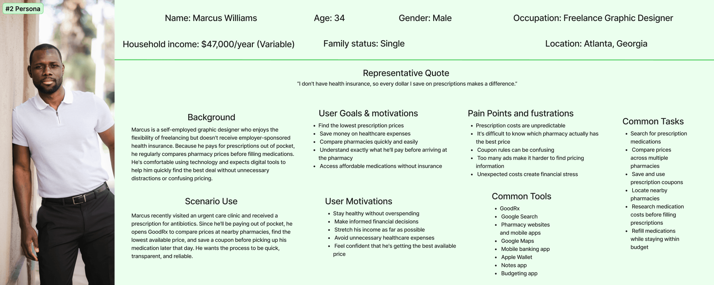
Personas


Using Research and AI to Shape a Clearer Budgeting Experience
Ideation & Design
Based on our research, we focused the redesign on making search more visible, improving pharmacy comparison, and simplifying coupon guidance. I led an ideation workshop where the team reviewed key findings, generated concepts for each core flow, and explored solutions through reference images and early wireframes. I then narrowed the ideas based on user impact, feasibility, and their connection to GoodRx’s conversion and revenue goals.
The selected concepts were developed into redesigned flows and high-fidelity prototypes, including clearer pharmacy cards, price and savings breakdowns, improved search visibility, and more readable coupon instructions. ChatGPT supported the process by helping organize workshop ideas, compare solution directions, refine design rationale, and document trade-offs, while the team made the final design decisions based on research findings and project goals.

Ideation

Final Design


Testing Confirmed a 40-Point Increase in Task Completion and a 15% Reduction in Completion Time
Testing & Final Reflection
Testing and Design Tradeoffs
We tested the redesigned flows with 10 participants using the same medication search, pharmacy comparison, and coupon redemption tasks in both the current GoodRx experience and our prototype. The redesign produced a 40-point increase in successful task completion and a 15% reduction in average completion time.
One trade-off was that the redesign did not look dramatically different from GoodRx at first glance. We intentionally preserved familiar patterns where they already worked and focused instead on clearer hierarchy, stronger decision support, and reducing friction across the full savings journey.
Final Thoughts
This project reinforced that meaningful UX improvements do not always require a complete visual overhaul. By improving the flow between search, pharmacy comparison, and coupon use, we were able to make key tasks easier and faster to complete.
If I approached the project again, I would provide clearer task instructions, examples, and completion criteria for the team, along with stronger onboarding and more frequent progress checks to reduce confusion and improve time management.